
|
We are Back At it again! Although we did not slowed down during the pandemic, our focus was on organizing ourselves efficiently so that we could continue working and oblige the government safety protocols put into place. We are excited that things are returning to normal, and hope we can put these two years behind us. During a particular zoom call we were asked what the difference is between an Interior Decorators and Designers. Although both have similar qualities that are used in these two professions, they often get confused for each other. So, how do you know when to choose a Designer or a Decorator?
So how should we choose which one we need? The project requirement depend largely on the skill set of the hired professional and not just the job tile, but usually if the job requires structural work; such as windows or walls to move you may need a designer. If the project is mostly aesthetic; changing furniture or colours a decorator is perfect. But the most important decision is understanding your needs and looking for someone who has a proven reputation for meeting them. So, with your upcoming renovation project, who are you going to call? We hope it will be LA Home Solutions! 
0 Comments
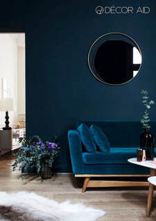
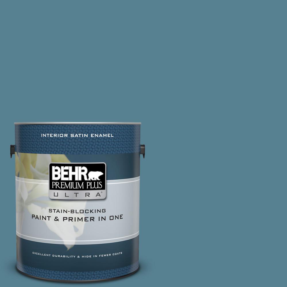
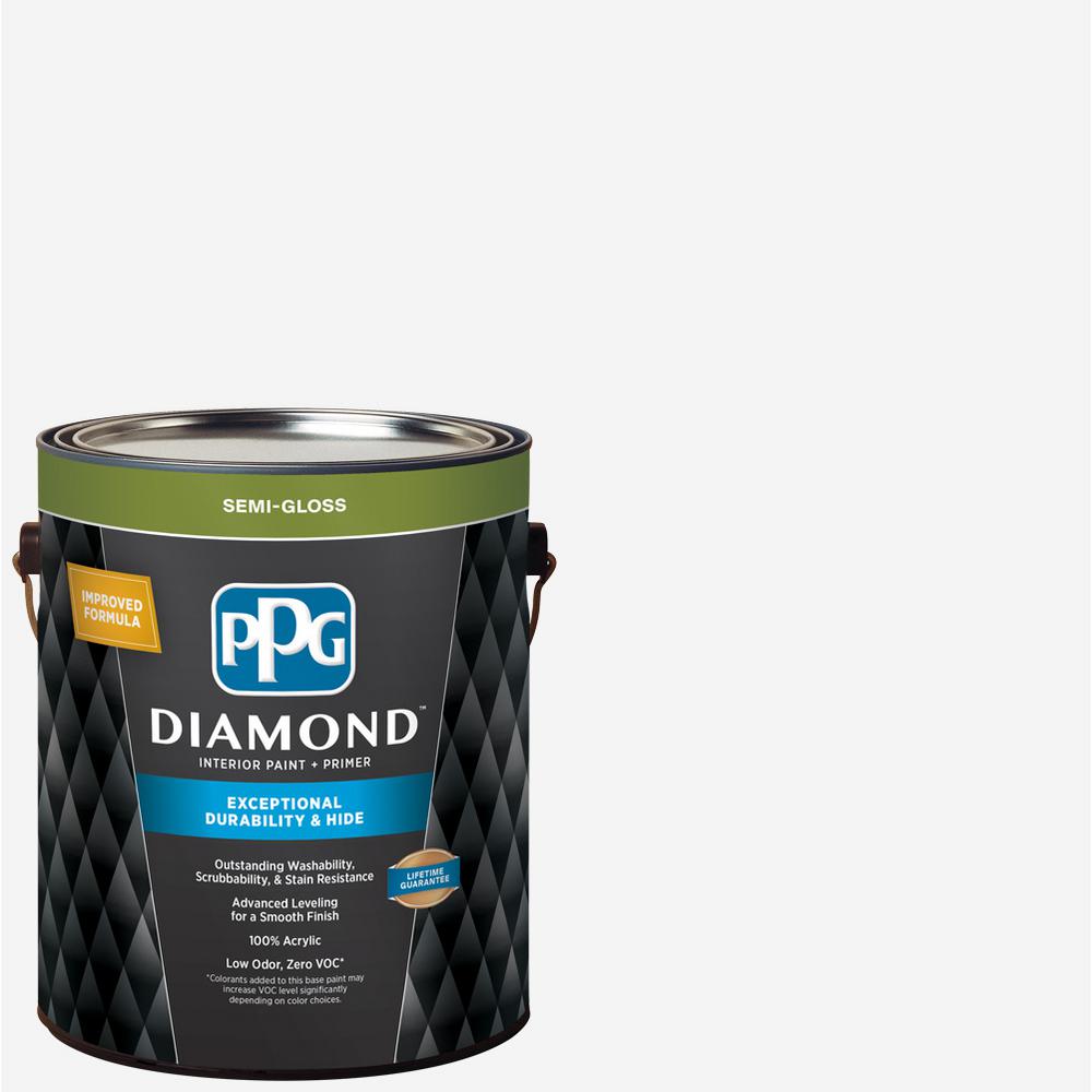
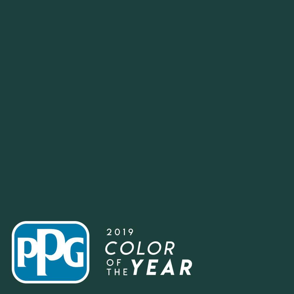
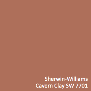
Trends have always been a statement about the economy and importance of materials to express the individual personality of each person, however trend tend to recycle over time, and certain features can linger longer then others. We have been carefully following trends the last few years and have predicted the new features that will make a surprising return from the past. The biggest change we have seen in trends are the colour pallets, we are seeing cooler hues like Behr’s Blueprint, PPG’s Diamond, PPG’s Night Watch, Sherwin-Williams’ Cavern Clay, and Benjamin Moore’s Metropolitan being used to bring life to spaces after many years of beige and whites taking such a fore front in the home.
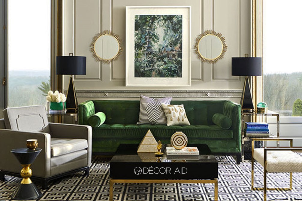
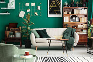
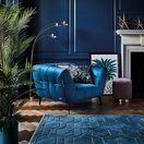
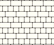
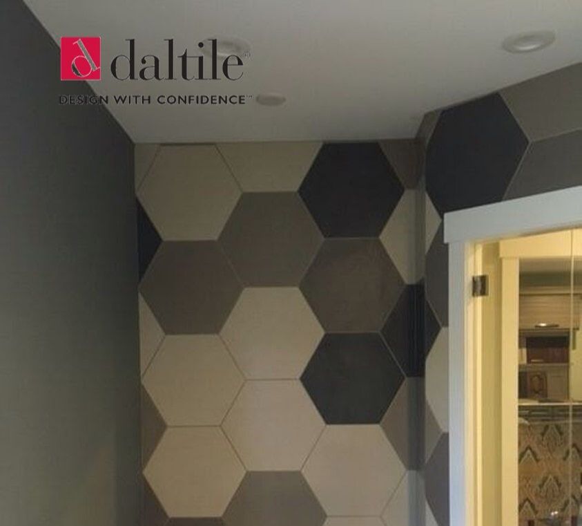
The 70’s are coming back in bold geometric patterns wall paper and tiles, they are showing up in unique spaces and we are LOVING IT! Hexagons and Fish Scales are some of the most featured, with the ever classic subway tile of course. If you are feeling more daring, agate or geode wallpaper have made continual appearances in home and event décor for accent walls in bedrooms, living rooms, dinning rooms, entryways, and even bathrooms. Also displaying 70 chic is the lighting fixtures, both in shapes and colour tones, black with gold or brass trim have mimicked their older counterparts with LED and sustainability. These pieces both demand your attention, and also comfortable blend into the décor to create a seamless flowing design. Canopy Beds are making a delightful return with a chic frame and light flowing fabric cover in creams and pale tones to create a fresh and elegant Scandinavian style. Some Velvet furniture pieces, throws, and pillows in deep blue, hunter green, or plum purple with contrasting counter parts in the floral Patterns found in rugs, carpets, and accent pillows have us squealing in delight! Another trend that is gaining popularity is the return of brown flooring, not an orange colour tone that was found in your great grandmother’s home, but a softer and more naturally rich wood tone. Bringing warmth to the designs in a subtle manor. There are more gray toned flooring that have incorporated brown undertones to create a neutral pallet that can match multiple tones and hues.
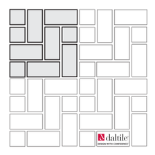
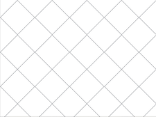
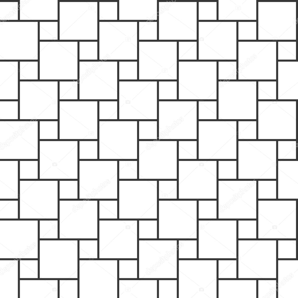
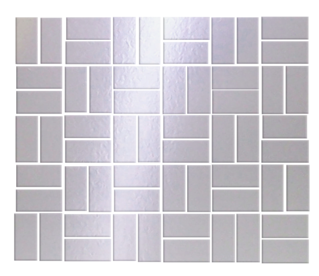
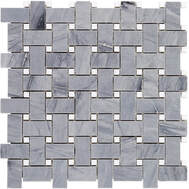
Trends have always been about a statement and how we express out selves, with these popular items coming into the play in the design world, we are excited to see how they are used to express individuality and uniqueness of each space. Which trend is your new favorite - let us know in the comments below!  You want to change the existing tile, or even add tile to your space, but what pattern should you use? What patterns are there? Using the right pattern can elevate your design, polish the space, and add to the resale value of your home. Before we get too carried away, remember to always try dry-fitting the pattern you are thinking about, and make sure you like it. Take some time to look at the finishes in the room and use websites like Pinterest to get ideas for what can be done to your space.
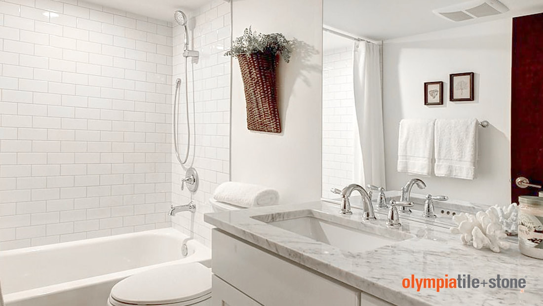
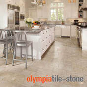
There are so many options, colors and styles to choose from, and we offer a free in-home consultation! Let us help you pick the perfect tile for your space, Visit us at 716 1st ave South, Lethbridge AB. 
Licenced – If the contractor does not have the proper paperwork (documents, insurance, permits, etc.) and doesn’t want to sign any documents that could be an indication that trouble lies ahead – especially if they try to talk you out of needing permits! In cases when disputes or misunderstanding happen, these legal documents are what keep you, your family, the contractor, their workers, as well as home safe years to come. Simply having verbal agreements leaves room for misunderstandings and can leave both parties feeling bitter about the other.
They are not busy – Good work is hard to come by and a contractor who has a wide-open schedule could indicate they are not the contractor for you. There are always quiet parts of the year where home renovations and building are concerned, make sure you know the off seasons for the area and the company. Another indicator could be their job sites. Monday morning or Friday afternoon have been quiet consistently, your contractors are absence could be using those times to buy materials or tie up paperwork and permits…or they could reflect on the overall professionalism and commitment. If you are uncertain discuss it with your contractor, communication is the key to a successful business.
c) A very important detail to look for is a cost breakdown. You are investing in your home when renovating, it is important then to know where your money is going, a reliable kitchen renovation contractor will provide an estimate that includes a breakdown of the necessary expenses. Deadlines –Contractors work on a schedule and have certain milestones to completed projects by, sometimes things will come to light that may push the project deadline back – if your contractor is known for missing a lot of deadlines it could be a red flag that you have hired the wrong person!
  In the kitchen we cook, clean, eat, and socialize with friends and loved ones. The kitchen is a focal point for many homes, so how do you know when you should renovate? It would be impossible to change your kitchen based on the trends that change like socks – every six months a new floor, back-splash, or just not have access to it during the remodel. Who has the time or money to do that? (If you do please share some tips!) So how would you know when a good time to renovate is? I have done some research and found 7 of the best reasons to renovate your kitchen:
Having no space is a serious inconvenience and can be very annoying when you’re trying to make food in the kitchen for your children while they are having a full-blown melt down. You many have had to store essential tools and ingredients in other rooms of the house and not being able to have all those items in the kitchen can lead to a lack of organization and a lot of frustration. You may be like me and not love cooking in general, but if you absolutely detest cooking in your kitchen the reason could be due to the layout of your kitchen. A lousy layout could make you feel cramped, draining, or could cause you to avoiding cooking. Kitchens in the past were not designed with ergonomics in mind, which means you back could be sore from having to bend over farther to reach the counter top, or from crawling around in cabinets to find important items. Did you know that the right lighting can change the whole space? If you are not quite ready to throw in the towel and get a whole new kitchen, try changing the light bulbs to a more white light, or a softer warmer light. Is there cracked, peeling, or other damages to the floor, counter top, cupboards, are knobs or handle falling off, are there chips in the wall? The kitchen is one of the most used rooms in the home meaning it receives the most wear and tear. Old cabinets and counter tops often have a peeling delamination of the finishes from wear and tear, heat and steam, or even water damage – This are usually superficial and purely aesthetic, but if not looked after could lead to more impactful damage. Are your drawers broken, or don’t open properly? That is a perfect indication that your kitchen could use a face-lift. If you have noticed other homes on your block are being renovated, it could be time to start looking at new designs. Due to the life cycles of homes there will always come a time when things become so outdated that renovating these important items will ensure the enjoyment and resale value of your home. Old appliances in your kitchen are probably the biggest reason for a high utility bill. Older appliances make more noise and work less efficiently than the newer energy saving appliances. The dishwasher is so small, outdated, and only partly cleans the dishes - it could take a few cycles to come clean, or may be it is that electric stove top that cooks unevenly, or it could be from appliances leaking and causing moisture to leave it’s mark. When was the last time you checked for mold?
 p.s. we really like cookies!
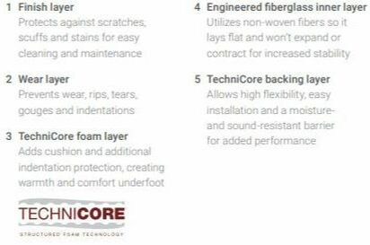
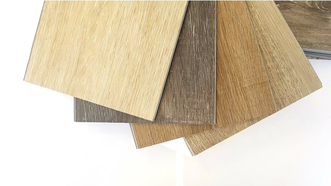
I don’t know about anyone else, but I always though Laminate and Linoleum were the same product, and there are so many different flooring products out there that it can get so overwhelming. Linoleum and Laminate used to be the popular choice – some people still prefer it over Luxury Vinyl – as it is affordable, and the new styles are par with the housing trends. The biggest difference between laminate and linoleum is the material used to create each flooring:
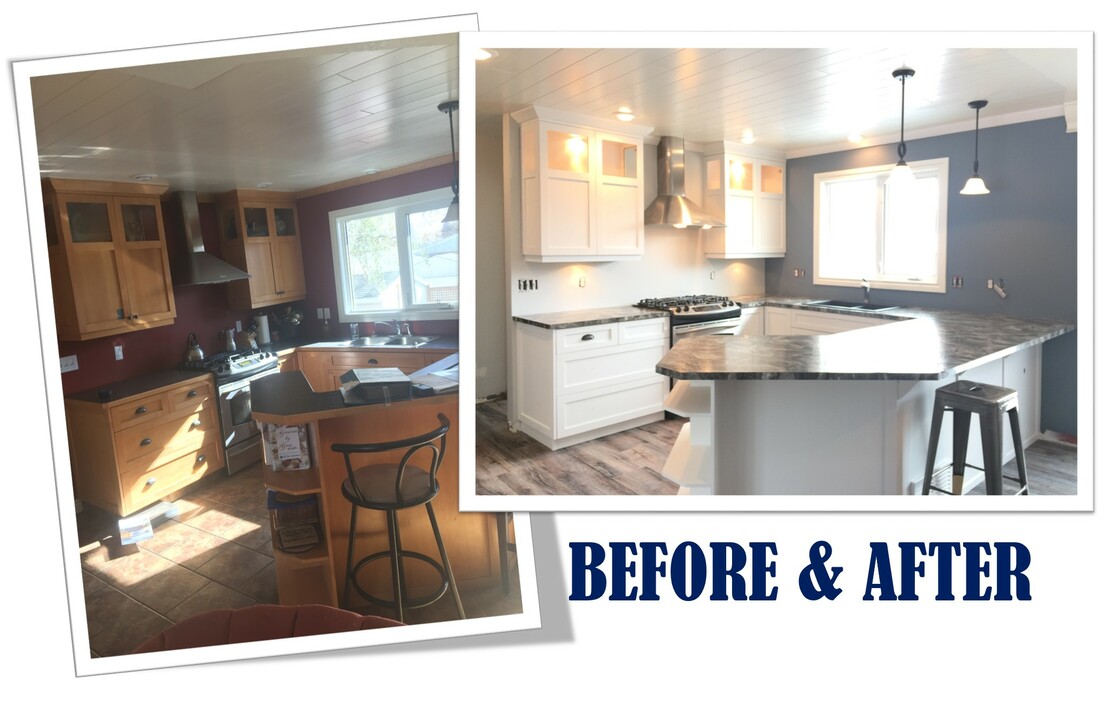
Installation is very important to consider with each product type, Linoleum is glued down to the sub-floor, while laminate floats on top of the sub-floor over a layer of underlayment (very similar to the Click Luxury Vinyl Product), which minimizes moisture seeping through and damaging the floor, this allows for a quieter and smoother surface as well. Linoleum is often selected for bathrooms or kitchens where water spills are a bigger problem as it is almost virtually waterproof, laminate acts like hardwood and can expand and crack with moisture, which is not ideal for water spills. Both Linoleum and Laminate have various patterns many imitating hardwood, tile, and stone however Laminate more closely resembles the hardwood flooring in both the feel and look, making it a popular choice, but no matter which product you decide to go with always consider the resale value and the room where the flooring will be used – Laminate tends to be more popular over linoleum, but both can be suitable for your home! Come visit us at our store's location and see our huge selections of laminate, Linoleum (Fiberfloor), Vinyl, Tiles and carpet.  We loved working on this full main floor renovation!
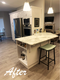
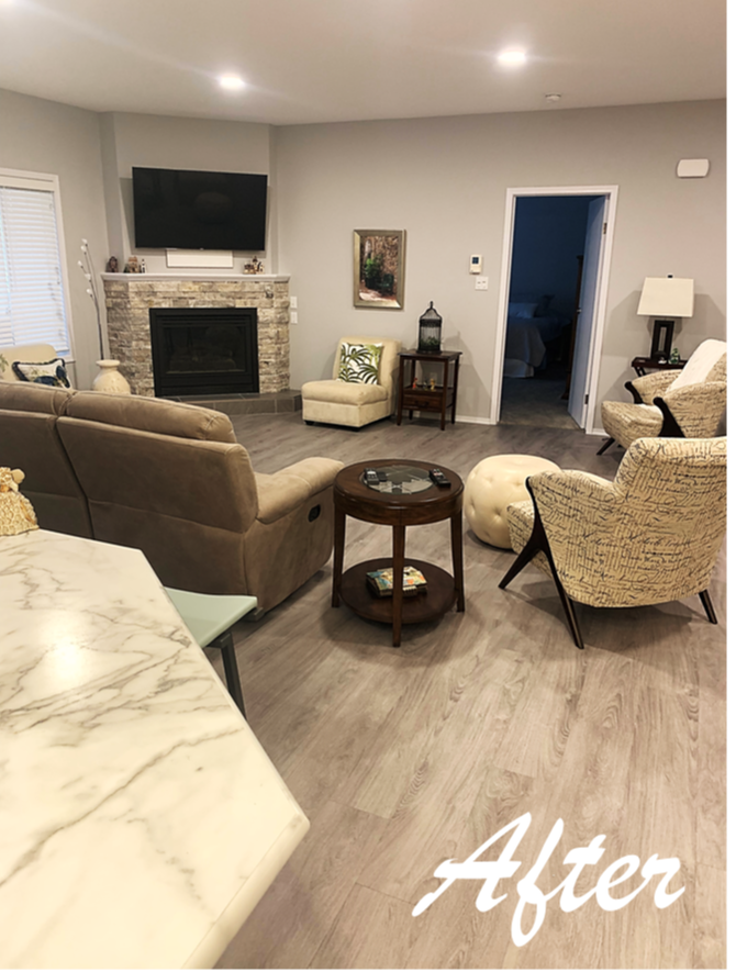
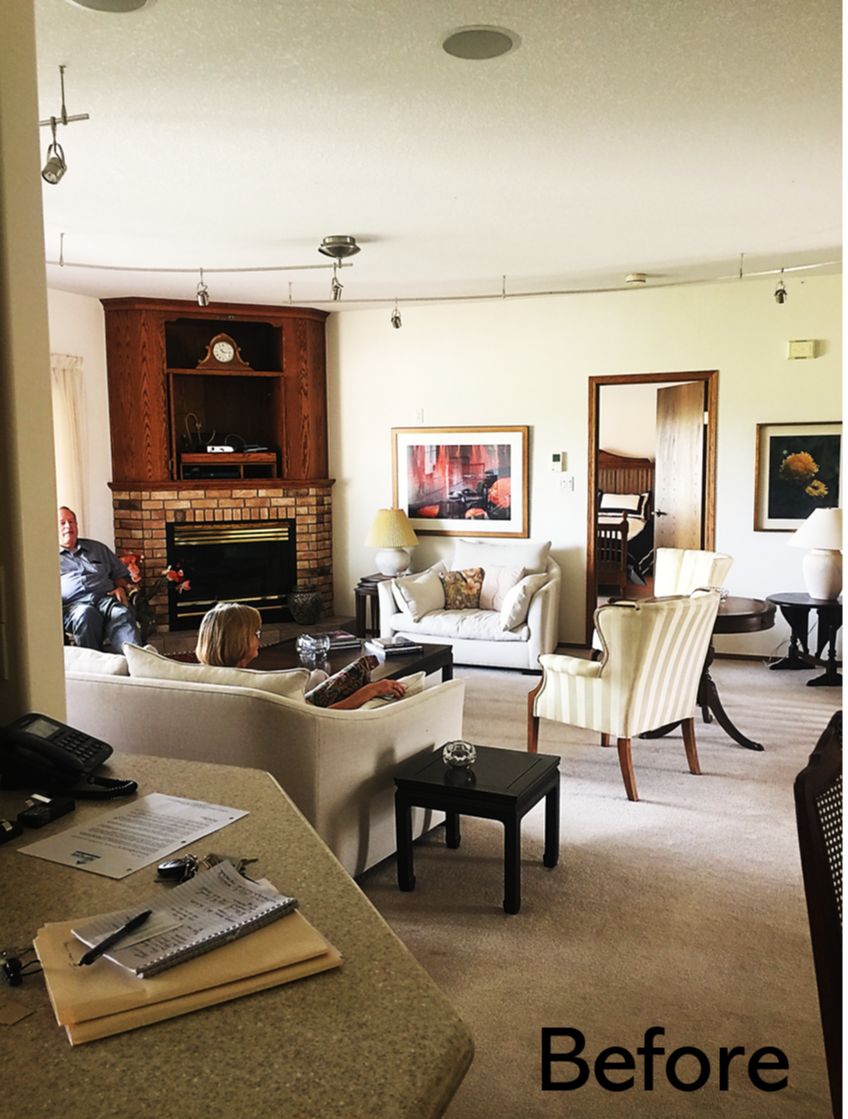
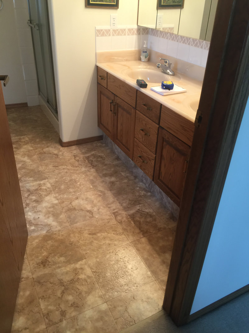
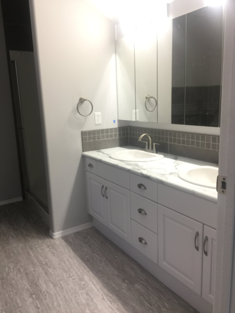
We installed new luxury vinyl plank throughout the open areas, and added new carpet into the bedrooms. The original space had oak cabinetry with hardwood floors and Linoleum in the bathrooms. The space felt dated to the owners. The kitchen lights were on a track, which did not provide enough light in the evenings, so they were removed and updated with pot lights and some beautiful drop pendants over the island. The oak cabinetry was painted over in a matte white, and a beautiful marble inspired laminate counter top was added to creating the look of luxury without the price tag. This was all complimented with a light gray colour on the walls. Oak was originally used in cabinetry because it repelled meal-worms, but it was also a luxury wood, so many have the opinion that you should not – on pain of death - paint over oak as it is still such a valuable wood. Though financially it can be more affordable to paint over them, than replace the whole kitchen - the decision is yours. Tavertine Stone was used on the fireplace to add a compliment with the new furniture. We just cannot get enough of this beautiful space.
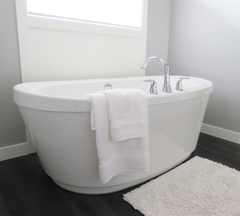
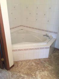
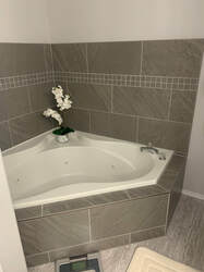
We also had the chance to renovate the ensuite with a new soaker tub and shower tile. We used a darker grey tile with a fun 2”x2” tile accent to enhance the small space, and to line the bathroom double sink. The clients were a joy to work with, and we are all so happy with how the space turned out - what a difference between the before and afters. Thank you for the opportunity to help you design your space. 
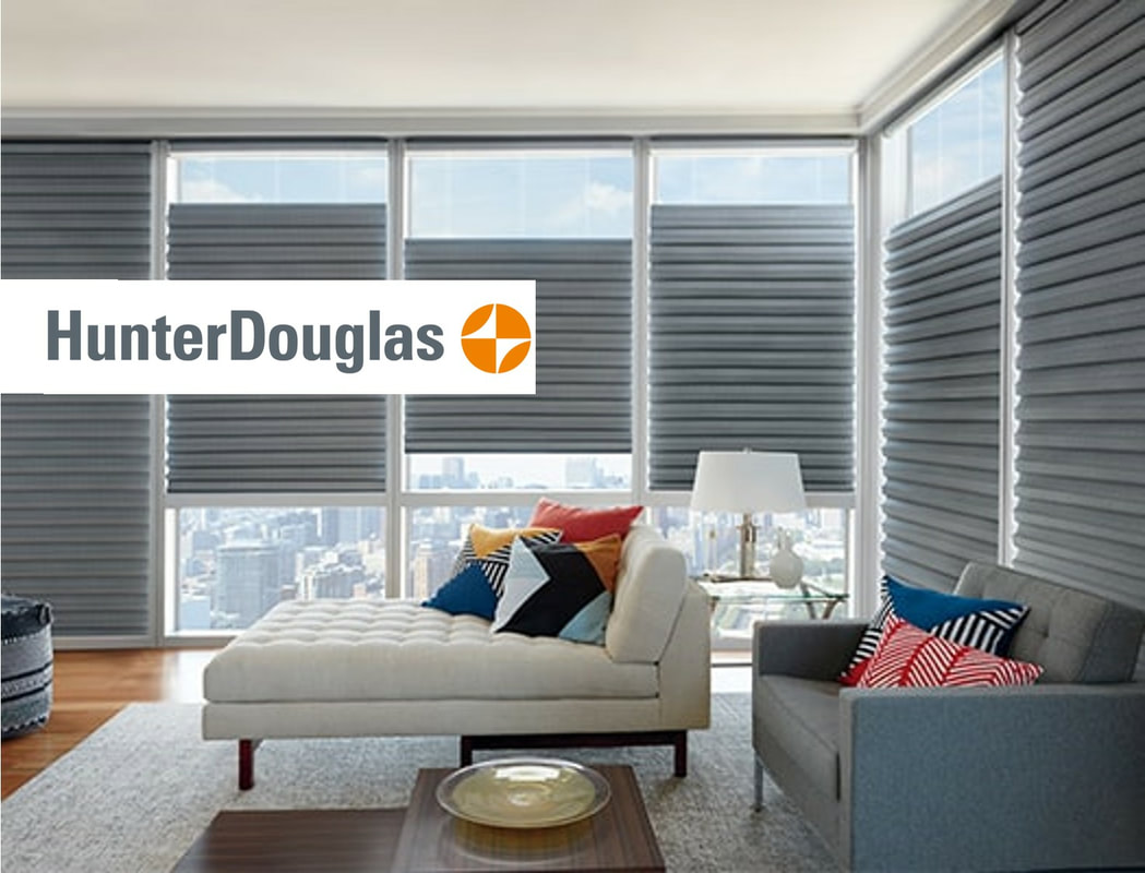
Open and Empty windows cause you to continually adjust to the suns movements, which blinds, drapes, and curtains are thought of as an aesthetic purpose, and to keep privacy. HunterDouglas has made waves in the window treatment community as the perfect invention for heat-savings. Utilizing the natural heat from the sun to keep your home warm is what the Government of Canada calls ‘Solar Heat Gain’. By opening the window coverings on south-facing windows allows the sunlight to heat your home without needing to turn on the furnace, the warmth could be significant enough to even be able to turn off your furnace in the winter. This can result in a lower heating bill!
Likewise in the summer keeping the drapes and blinds closed during the sunniest times of the day, and open overnight to naturally cool the house down. Also Reducing fan usage and air-conditions and still have your home at a comfortable temperature. There are 5 main reasons why you should choose HunterDouglas. 1. Reputation. By providing top-quality products at the forefront of design trends for decades Hunter Douglas has a reputation and commitment for staying at the cutting edge of design and technology. 2. Lifetime guarantee. Believing in its products, Hunter Douglas will take care of the maintenance at any time, their warranty covers the products for as long as you own them.
5. GreenGuard Air Quality Certification. The GREENGUARD® Environmental Institute has commissioned Hunter Douglas to verify it’s product and meet strict indoor air quality guidelines. The exquisite style and superior quality, the GREENGUARD certification ensure the products are as environmentally friendly as they are beautiful. The GREENGUARD Indoor Air Quality Certified Mark is a registered certification mark used under license through the GREENGUARD Environmental Institute. Blinds are no longer an aesthetic room piece, but an innovative necessity to your home and environment, keeping you happy and healthy – who isn’t happy saving some money! Come check us out downtown at L.A. Home Solutions, 716 1st ave South, and let us help you pick the perfect HunterDouglas window treatment for you!  Luxury vinyl has started to take over, but why? Well, your quick answer is because it is waterproof and affordable. For those who do not know Luxury Vinyl is a floor product that has the look of hardwood or stone without the price tag. The two most common types that can be found are the Tile (LVT), and plank (LVP).
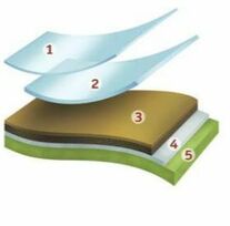
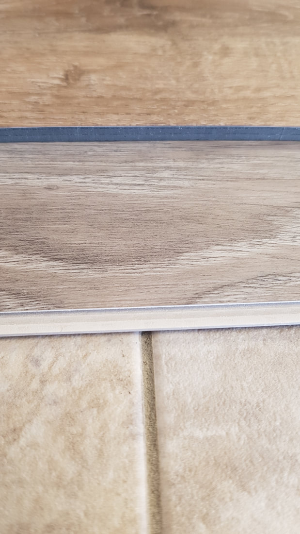
When we say Overall Thickness, this means LVT/LVP can be anywhere from 2mm to 6mm thick in whole. The Luxury Vinyl itself is usually 1 mm to 5 mm depending on the style. Every product has what is called a ‘Wear Layer’. This is a protective layer overtop of the vinyl, it is stain resistant, water resistant, easy to maintain, and scratch resistant. This layer is usually made from polyurethane and is .12mm to 1mm thick - It is important to get the right wear layer for your lifestyle. ‘Edge Treatments’ can be squared, this is used with the seamless look or beveled edges for a hardwood imitation. And rounded edges for the grout-able tiles, that is right, you can grout Luxury Vinyl! There are a few 'installation methods' that can be used depending on the LVT/LVP. The most used are your Loose-lay or glue down, these tiles are sometimes thick enough that they should just lay on the floor but would need to be glued in some places (like the parameter or over bumpy spots, or any that would be in direct sunlight, etc.), or thin enough that they should be glued all over. There is the Click product that fits together like a puzzle, this type can have multiple backing options ranging from a foam to cork, the click can be installed over most already installed flooring! (not carpet!)
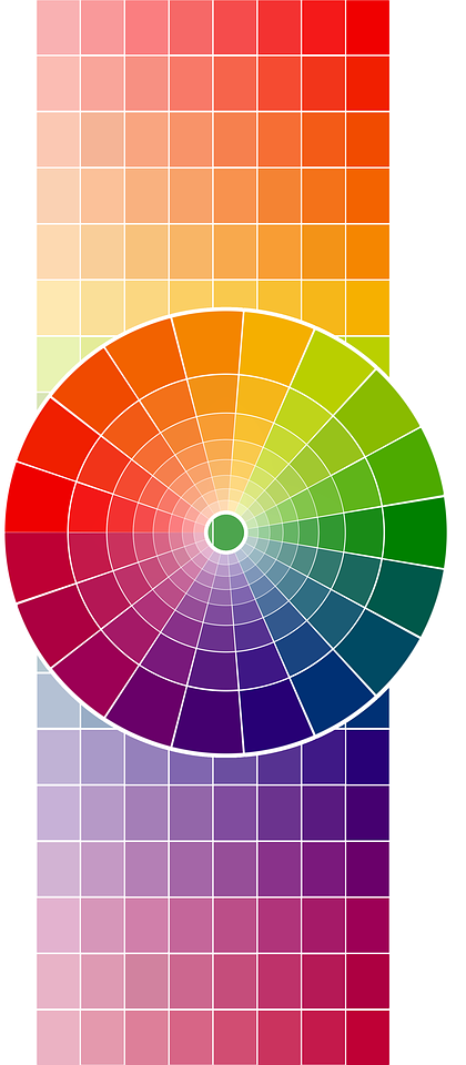
Red – is a warm and positive colour with strong and powerful energies, the colour red excites emotions, motivates, stimulates appetite (often found in restaurants) and increases cravings,shows confidence, passion, causes action, creates ambition, determination, and can heighten sexual passion. China and India - red is the colour for luck and purity, most brides would wear it (they have started wearing more whites). Be careful though, too much red can cause us to become irritated, agitated, and angry! Orange – has adventure and risk-taking, it has the physical energy from red, and cheerfulness of yellow. It is a colour that is social, interactive, and aids in new ideas, freeing the spirit. Orange encourages self-respect and stimulates two-way communication. It is the most rejected and under-used colour. Yellow – is happy, and relates to the mind, and awakens confidence and intellect, it is optimistic, uplifting and creates enthusiasm for life. It is a great communicator, entertainer and provides clarity, stimulates growth and change. Too much yellow can create anxiety and is non-emotional, It is one of the most highly visible colours, but many older people do not respond well to large amounts. Green – is the colour of balance, harmony, and rebirth. It relates more to the heart and health with growth, self-reliance, positivity, and sense of well being. Green is a peacemaker colour, with the mental clarity from yellow and the emotional calm from the insightful blue. Green creates hope and love, a sense of nature and family, it creates stability and endurance.
Grey – is an unemotional colour, it detaches and neutralizes the surroundings creating a calm and composed environment. Grey can be drab and depressing, or elegant and formal, it is conventional, dependable, practical and mature. It has a steady effect on other colours that it comes into contact with by toning down and illuminating different colours. White – is pure, perfect, innocent and represents wholeness and completion. White is the colour of new beginnings and opens the way for creativity, and equality. It is natural and independent, and totally reflective. In some cultures, white is traditionally related to death and mourning by indicated the completion of a ‘cycle in your life’. Too much white can cause feelings of isolation and emptiness. Black – creates an air of mystery and secretive. It creates a barrier by providing comfort while protecting and hiding the vulnerabilities. Black is also the colour of control, intimidation, elegance, discipline, and authority. Black is the end but also implies a new beginning. Here is a fun colour test you can take for free - What colour did you get? Let us know in the comments below!  |
Megan Plausteiner, IDT
Interior Designer @ LA Home Solutions. Creating beautifully designed spaces. 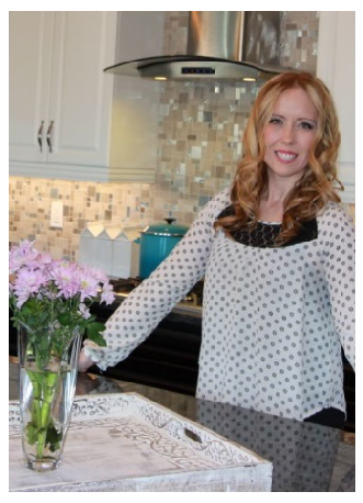
Archives
August 2021
Categories |


 RSS Feed
LA Home Solutions Inc. 716 1st Ave S, Lethbridge, AB, T1K 0A7 Ph: 403.320.9680
~Have a Beautifully Designed Day~
~Have a Beautifully Designed Day~